
Overview
This project transformed a legacy Electronic Data Interchange (EDI) platform—originally built in the early 2000s—into a modern SaaS experience for B2B clients in Brazil’s supply-chain sector.
The redesign addressed long-standing usability and visibility issues in document exchange workflows, directly improving customer satisfaction and retention.
The redesign addressed long-standing usability and visibility issues in document exchange workflows, directly improving customer satisfaction and retention.
Impact
After the MVP launch to beta clients, we monitored product metrics over the first 90 days, comparing a group of users of the new MVP with a similar control group using the standard EDI:

* Measured between 488 users split between two groups over the course of 90 days period after the MVP deployment.
Key outcomes:
• Improved satisfaction across high-risk accounts
• Enhanced user autonomy through clearer error states
• Validated the impact of UX changes through analytics and client feedback
The Challenge
The legacy platform automated the exchange of business documents—purchase orders, invoices, and shipping notes—but had become complex, error-prone, and visually outdated.
Users struggled with:
Users struggled with:
• Low error visibility in EDI traffic (hard to identify failed transmissions).
• High learning curve for new operators.
• Dependence on support for routine troubleshooting.
As a result, the company faced rising churn among key accounts and a growing support backlog—threatening both scalability and client satisfaction.
My Mission
As the UX/UI Designer on the project, my goal was to:
• Redefine core user flows to eliminate friction and reduce errors.
• Design a data-driven, intuitive interface aligned with business KPIs.
• Lead discovery and validation sessions with real users to ensure product–market fit.
• Deliver high-fidelity prototypes and handoff assets ready for development.
Process & Strategy
Kickoff & Strategic Alignment
I co-facilitated a cross-functional kickoff with stakeholders from Customer Success, Product, Engineering, and Design.
We mapped project risks and opportunities using a SWOT matrix, aligning the MVP scope with key metrics:
We mapped project risks and opportunities using a SWOT matrix, aligning the MVP scope with key metrics:
• Reduce churn by 25 %
• Cut support tickets by 20 %
• Improve onboarding speed to 50 %
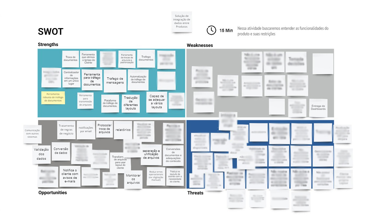
The SWOT matrix from the EDI kickoff (some sensitive information is blurred)
Discovery & Data Analysis
Through CSD Matrix, Empathy Maps, and User Journey sessions, we identified pain points and quantified their frequency using customer support data.
The support team confirmed that over 40% of tickets were traffic confirmation request.
This insight became one of the guiding metrics for UX prioritization.
The support team confirmed that over 40% of tickets were traffic confirmation request.
This insight became one of the guiding metrics for UX prioritization.
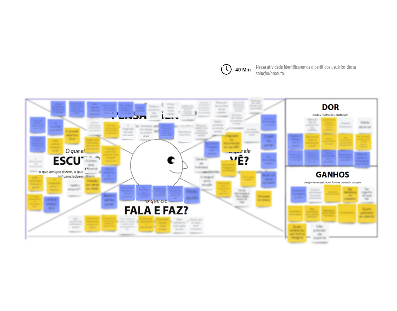
Empathy Map and User Journey boards: discovering user pains and identifying opportunities
MVP Definition & Prioritization
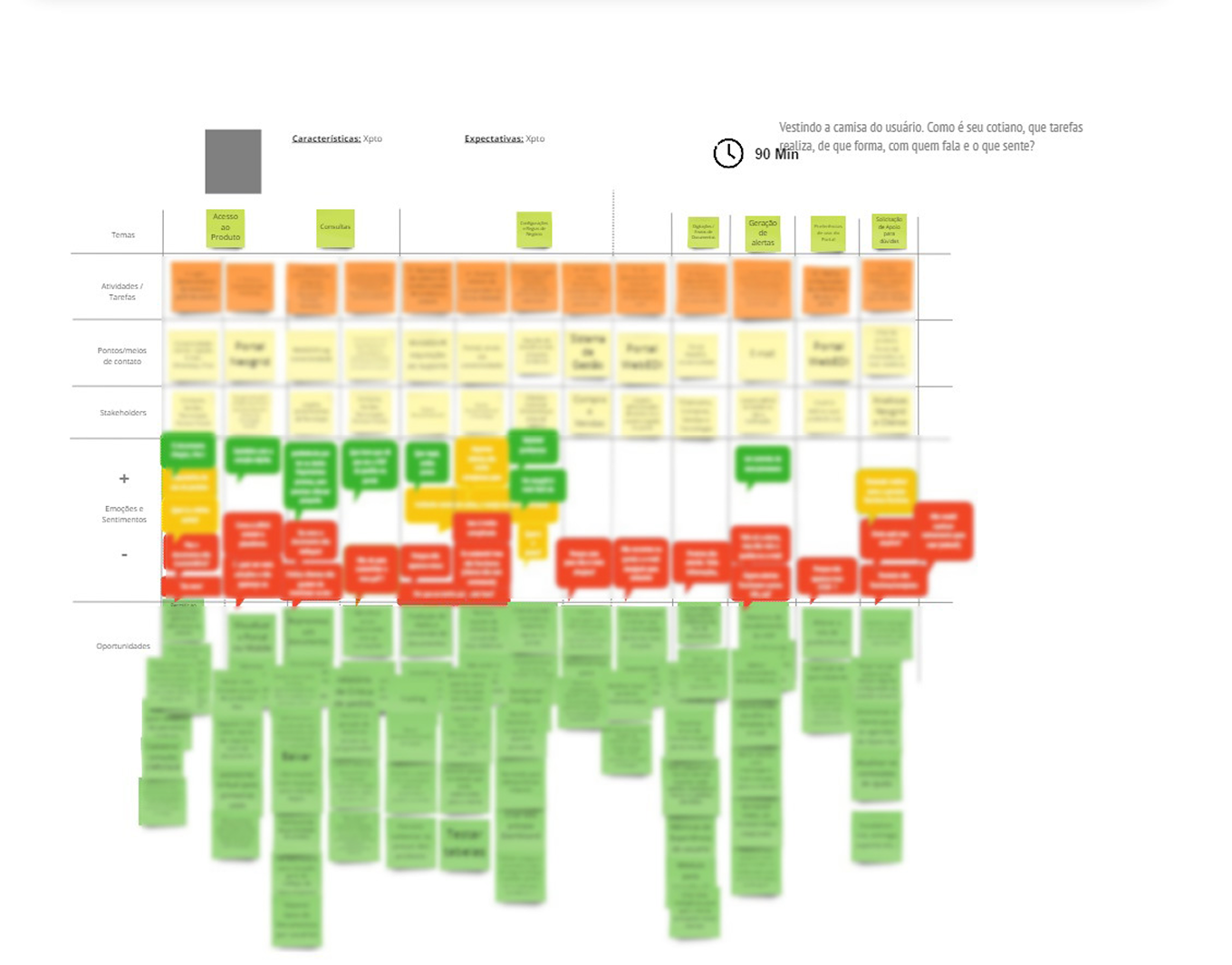
We created a Feature Selection board, scoring each existing feature by usage frequency (from analytics) and perceived value (from user interviews).
This evidence-based ranking helped us trim underused features and define a lean, data-validated MVP.
This evidence-based ranking helped us trim underused features and define a lean, data-validated MVP.
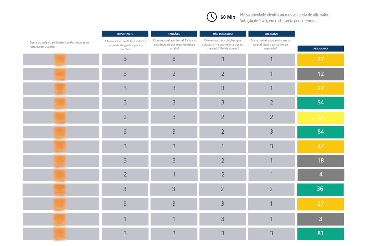
"Feature selection" board, filled for organize the MVP
Flow Design & Wireframes
I designed flowcharts and low-fidelity wireframes built around clear mental models—“inbox/sent,” “read/unread,” “status by color”—borrowed from familiar email paradigms.
This analogy reduced cognitive load and improved findability during usability testing.
This analogy reduced cognitive load and improved findability during usability testing.
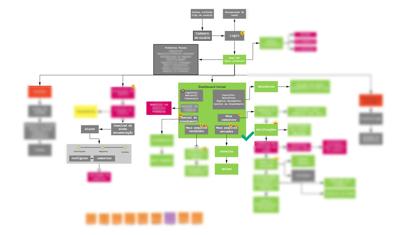
Flowchart of the main possible MVP user interactions
Validation cycles
We conducted wireframe validation interviews with selected B2B clients.
To promote honest feedback, I deliberately presented rough wireframes, signaling openness to change.
The feedback informed measurable UX improvements:
To promote honest feedback, I deliberately presented rough wireframes, signaling openness to change.
The feedback informed measurable UX improvements:
• Error discovery steps reduced from 7 to 3.
• Average task completion time improved by 35 %.
Some wireframes presented to receive feedback from users
UI Design & Implementation
Using the Neo UI Design System, I built high-fidelity prototypes in Figma—accelerating design decisions and ensuring consistency.
I partnered with engineering to validate component feasibility and ran post-handoff analytics setup (Hotjar) to track user behavior post-launch.
I partnered with engineering to validate component feasibility and ran post-handoff analytics setup (Hotjar) to track user behavior post-launch.
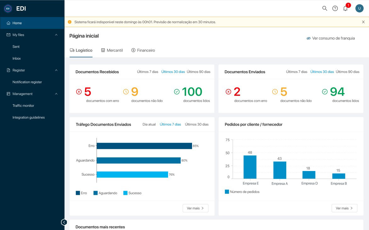
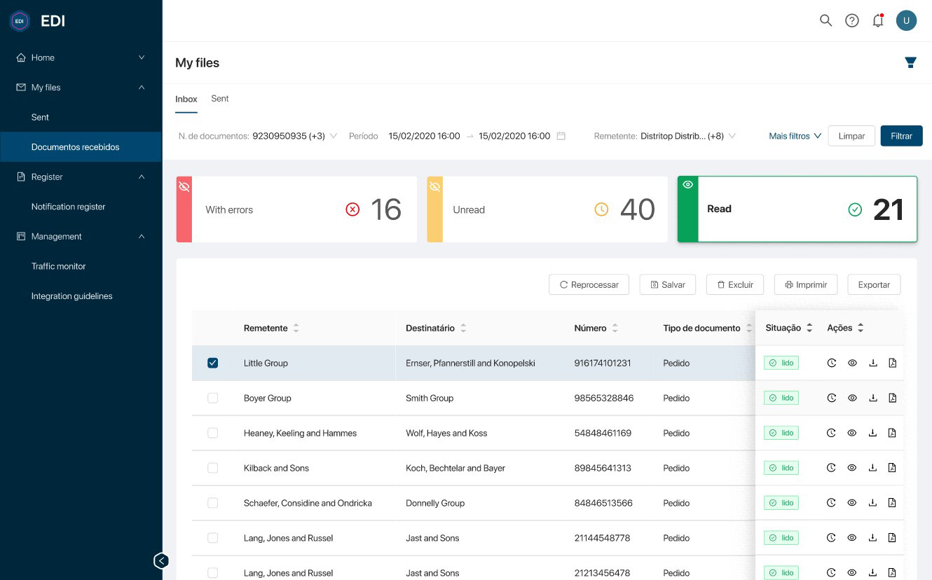
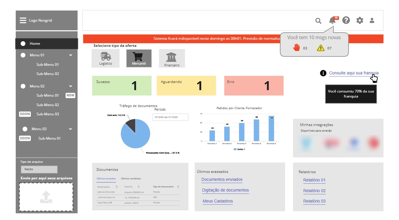
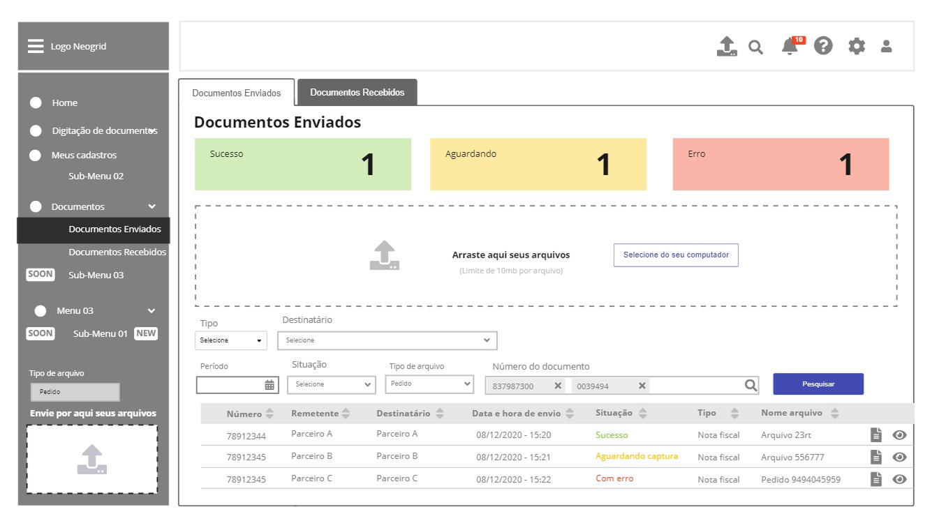
EDI high resolution mockups from Figma
What I Learned
This project reinforced how data-driven design decisions—supported by analytics, user interviews and validation cycles—can directly influence business health metrics.
By connecting UX strategy with measurable outcomes, we transformed EDI from a technical bottleneck into a retention-driving product and a reference for future SaaS initiatives in the company.
By connecting UX strategy with measurable outcomes, we transformed EDI from a technical bottleneck into a retention-driving product and a reference for future SaaS initiatives in the company.


