
Overview
By mid-2018, Neogrid’s product portfolio—built since 1999 through in-house development and company acquisitions—suffered from visual and technical inconsistency, with little standardization and fragmentation across solutions. Initially tailored almost individually for each client, the products were developed by isolated teams using different technologies and focusing on specific client needs. As a result, despite their quality and relevance, the products lacked a cohesive identity, with only a few visual elements like colors and logos offering any sense of unity.
Impact
1. Accelerated Product Development
⚡ Faster UI development with reusable React components
⚡ Reduction in design inconsistencies across 17 supply chain products
⚡ Fewer redundant design files by consolidating patterns
⚡ Reduction in design inconsistencies across 17 supply chain products
⚡ Fewer redundant design files by consolidating patterns
2. Improved Cross-Team Collaboration
🔄 100+ components documented in ZeroHeight, reducing tribal knowledge
🔄 Unified 4 acquired companies under one design language
🔄 Unified 4 acquired companies under one design language
3. Business & User Impact
📈 Drop in user training time thanks to intuitive, consistent patterns
📈 Devs reported easier maintenance
📈 Devs reported easier maintenance
4. Technical Foundations
🧠 Atomic Design adoption reduced component duplication
🧠 Ant Design customization saved 6+ months of build time
🧠 Figma Variables + Auto Layout enabled rapid theme ad state switching
🧠 Ant Design customization saved 6+ months of build time
🧠 Figma Variables + Auto Layout enabled rapid theme ad state switching
Key Takeaway
Neo UI didn’t just standardize components—it became the operational backbone for supply chain innovation, proving that design systems are scalability multipliers.
The Challenge
Neogrid managed 17 B2B supply-chain products, many of them highly complex and mission-critical.
But inconsistent UI decisions across teams resulted in:
But inconsistent UI decisions across teams resulted in:
• High rework during feature development
• Inconsistent accessibility practices
• Slow onboarding for new designers & developers
• Difficulty maintaining product quality across acquired companies
The company needed a unified, scalable design system that reduced operational friction and accelerated product evolution.
My Mission
I joined at the start of the initiative and was responsible for:
• Leading design critiques and establishing governance rituals
• Creating and refining components, tokens, patterns, and variants in Figma
• Adapting the system to Figma’s evolving capabilities (variants, interactive components, variables, conditional logic)
• Collaborating with DevOps and front-end teams to create a cohesive React + Figma ecosystem
• Documenting components in ZeroHeight, ensuring adoption across teams
In a nutshell: turn Neo UI into an operational backbone—reducing inconsistencies, increasing velocity, and enabling scalability.
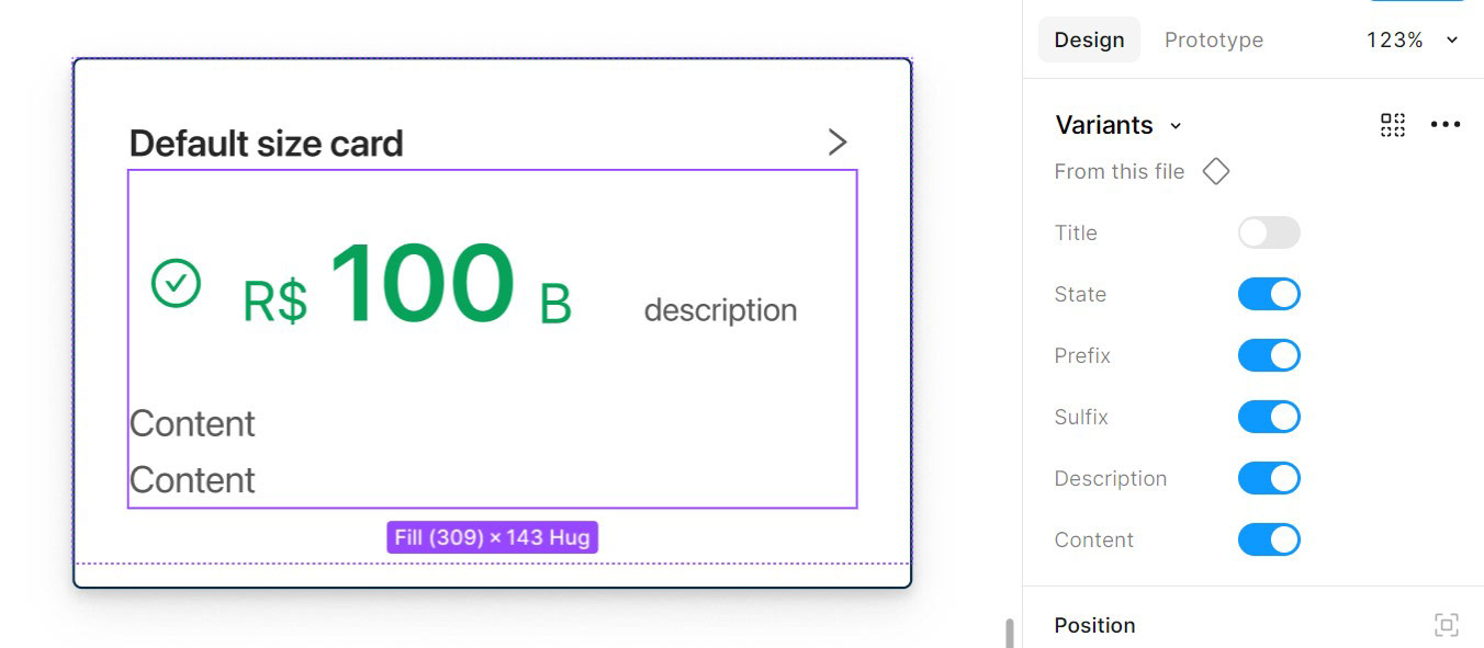
Building variants and Auto Layout configurations for Big Number
Process & Strategy
Foundation & Governance
We started by defining the pillars for the Design System:
• Atomic Design structure
• Design tokens for colors, typography, spacing, themes
• Ant Design customization aligned with Neogrid’s brand and product needs
• Governance model for proposing, approving, and documenting components
This created the technical and visual foundation for the system.
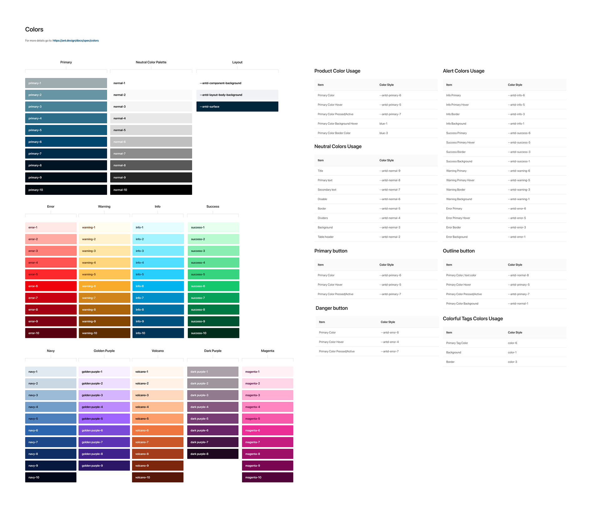
Color tokens
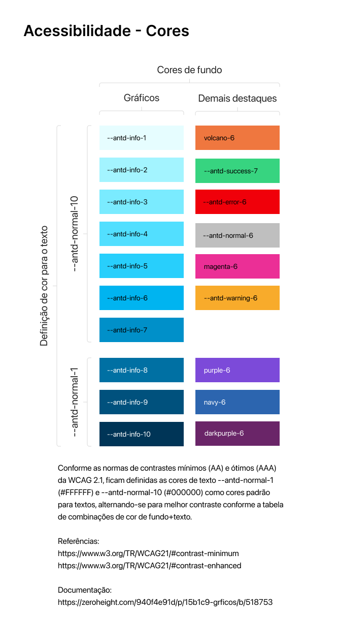
WCAG legibility gold standards
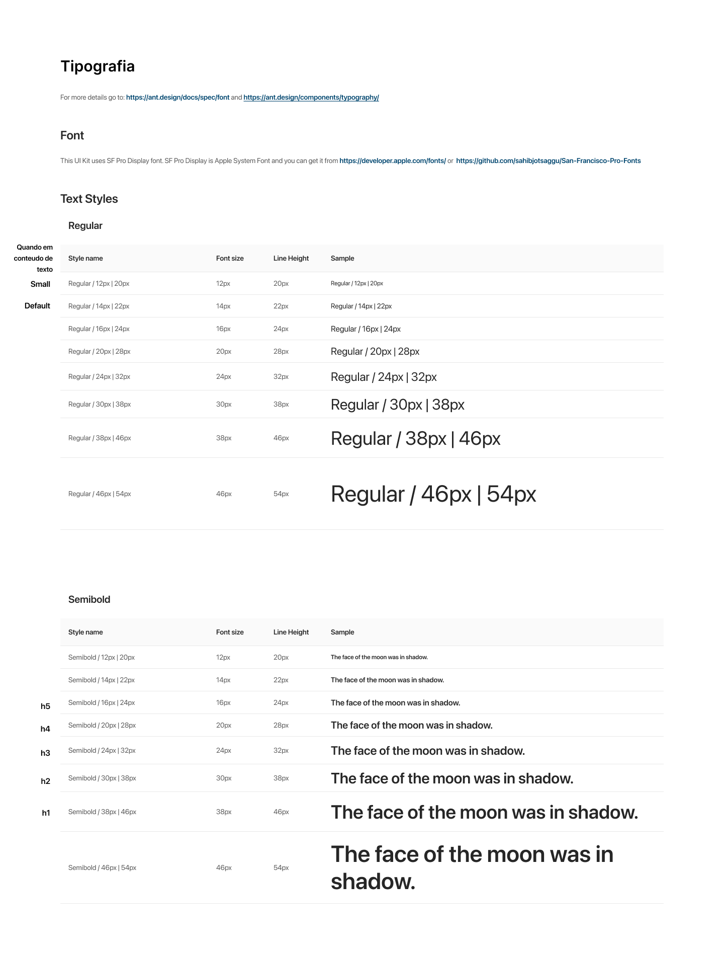
Typography tokens
Neo UI design tokens samples
Component Creation Workflow — A Data-Driven Approach
Each component followed a structured, repeatable workflow, ensuring quality and consistency:

Component creation workflow
Design Critique Ceremony — A Governance Ritual
To avoid fragmentation, we established a Design Critique routine that became core to Neo UI’s evolution.
• Daily critiques in the early phase, then gradually reduced as maturity increased
• A dedicated Figma board with four lanes:
Under Discussion → Approved → Blocked → Rejected
Under Discussion → Approved → Blocked → Rejected
• Voting and structured debates for conflicting proposals
• Clear reasoning documented for every decision
This ritual reduced design drift and ensured every product team contributed to a shared design language.
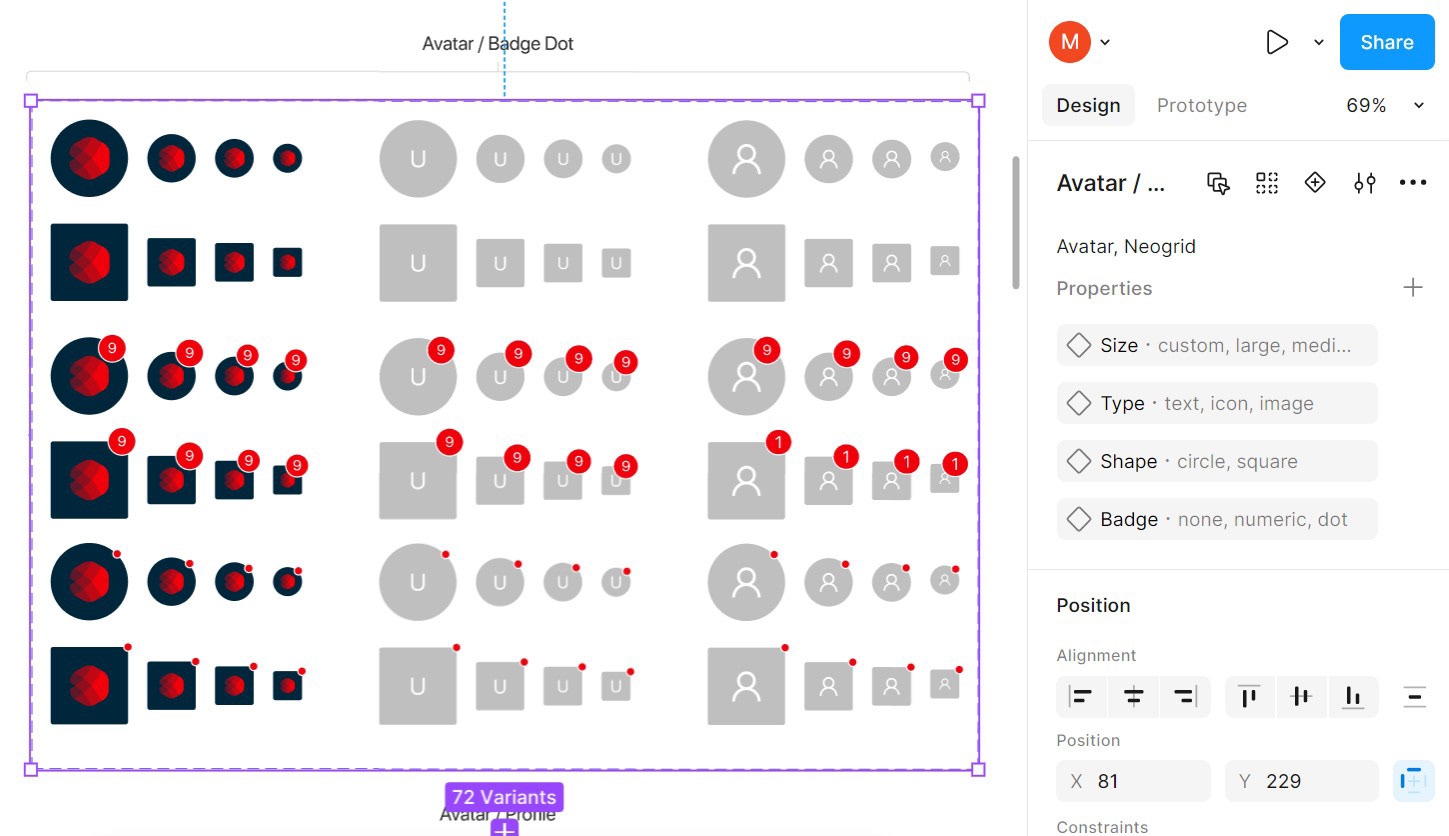
Avatar with badge dots variants
Figma System & Documentation
I contributed to:
• Building high-flexibility components using Auto Layout + Variables
• Creating variants for complex patterns (e.g., Big Numbers, dialog boxes, avatars, charts)
• Establishing color, typography, spacing, motion, and elevation tokens
• Improving responsiveness and reducing file bloat
• Implementing a Semantic Versioning system to track releases (2.0.5, etc.)
• Creating and publishing the full documentation on Zero Height.
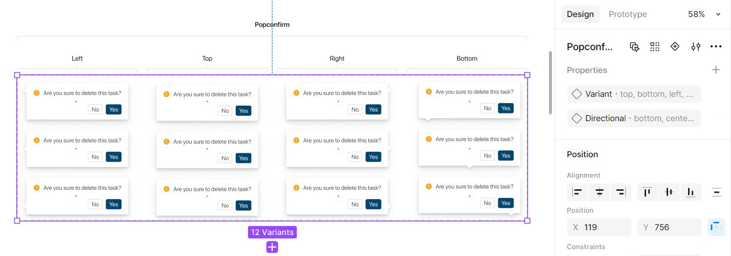
Popconfirm dialog box variants
Neo UI examples
Component previews in Figma


