
Brief
Electronic Data Interchange (EDI) solutions automate business document exchange between companies, replacing paper-based processes and manual interventions. This transformation enhances operational efficiency, minimizes errors, and accelerates critical workflows like purchase orders, invoices, and shipping documentation. By seamlessly integrating disparate systems, EDI ensures secure, standardized data flow while optimizing supply chain and financial operations. This case study showcases the complete user experience transformation of a legacy EDI SaaS platform (originally built in early-2000s technology). For context, this platform is mostly used in Brazil, so, most of the research prints are in brazilian portuguese.
My contribution
I participated in this project from the very beginning, helping to plan the collaborative exercises for the kickoff, organizing and facilitating discovery sessions, and collaborating with stakeholders to create product flowcharts and wireframes. I also conducted wireframe validations with clients, designed high-fidelity prototypes in Figma, and managed the handoff to the development team.
Throughout all these stages, I worked closely with clients and stakeholders to validate both the user experience and the UI. I also adapted certain interactions and UI elements to align with the technical constraints of the development process.
Kickoff
For the EDI kickoff, we brought together a team of internal stakeholders—including members from Customer Success, Product Management, Development, and Design—to define the scope of the MVP. As part of this process, we started by filling out a SWOT matrix (Strengths, Weaknesses, Opportunities, and Threats).
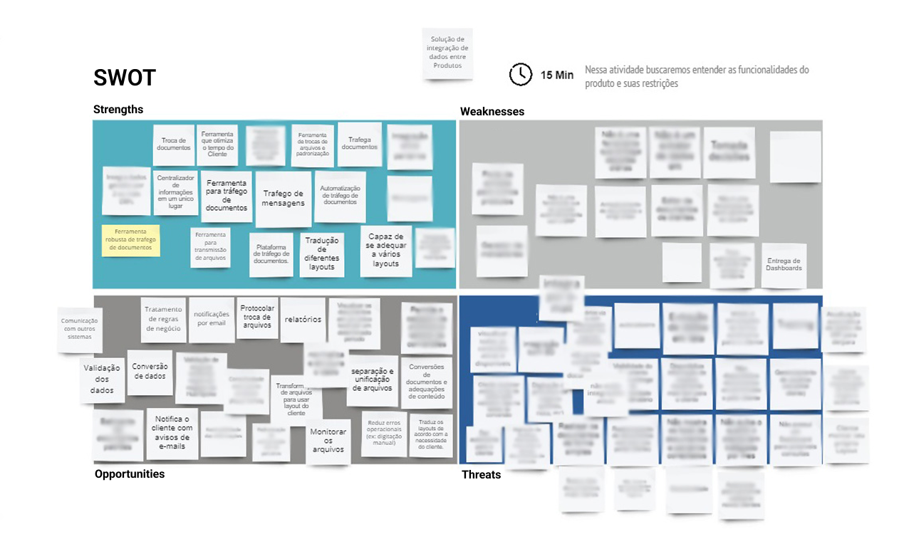
The SWOT matrix from the EDI kickoff (some sensitive information is blurred)
Discovery
After the kickoff, a smaller team was assembled to work through several collaborative exercises, such as the CSD Matrix, Empathy Map, and User Journey, in order to further develop the initial insights from the SWOT matrix. During this process, we began to uncover major issues with the legacy product, such as the lack of visibility into errors in document traffic.
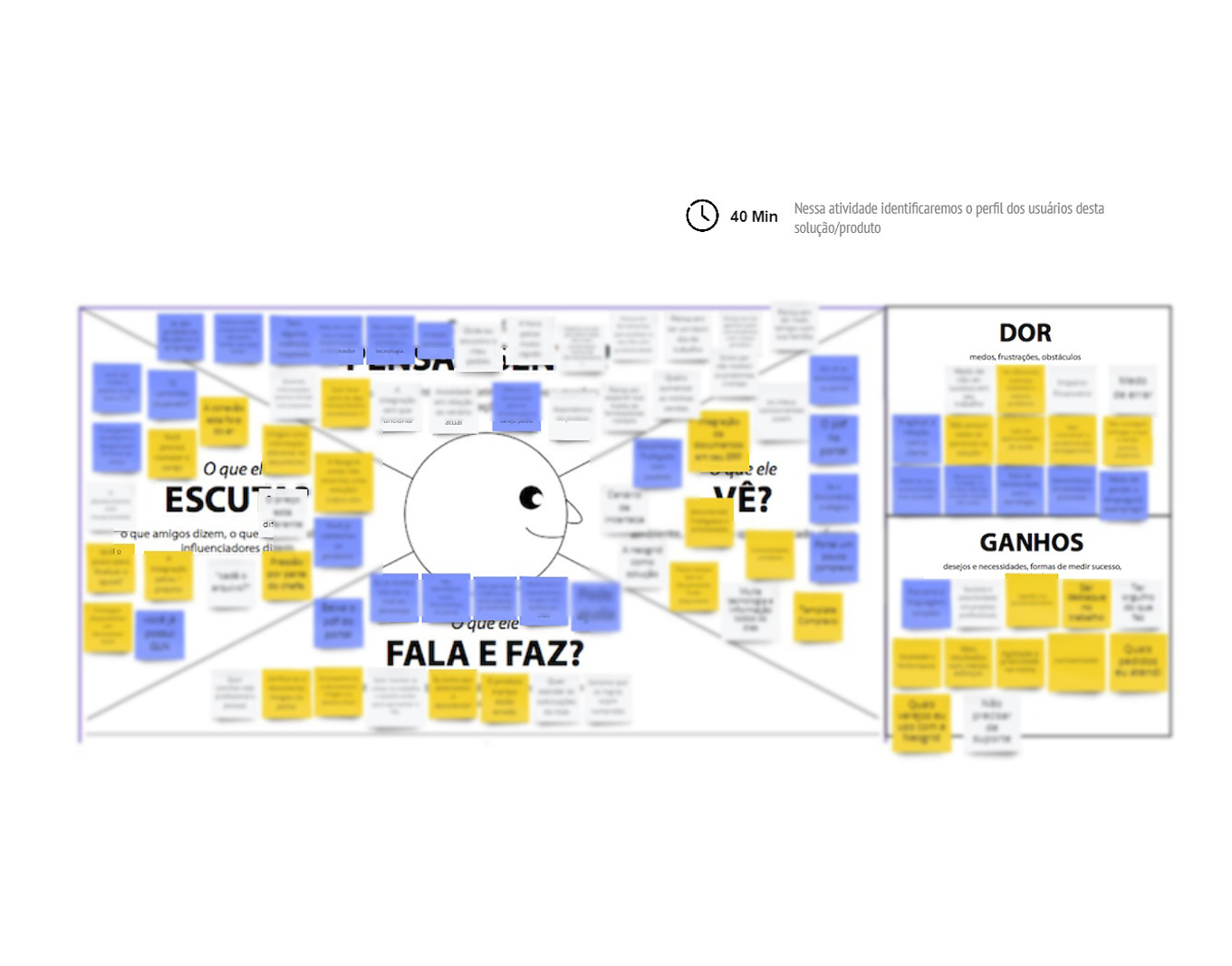
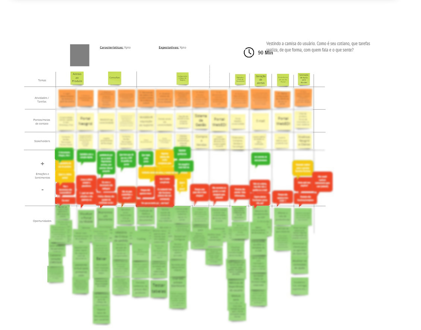
Empathy Map and User Journey boards: discovering user pains and identifying opportunities
The MVP
With a clear understanding of the strengths, weaknesses, and limitations, it became easier to define the MVP. The legacy product was massive, packed with features—many of which were no longer used—so it was essential to “trim the fat” and start fresh with a solid, streamlined MVP. One of the collaborative exercises we used at this stage was a board we called “Feature Selection,” where we listed all the existing features and assigned points to each in order to determine which ones should be prioritized.
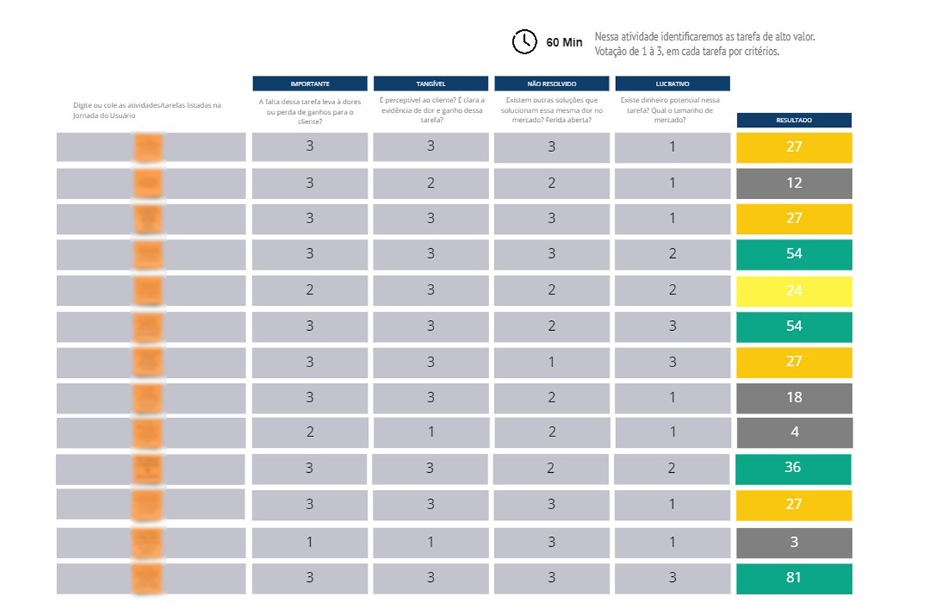
"Feature selection" board, filled for organize the MVP
Flowcharts and wireframes
When defining the core interactions, user interface, and user journey, we aimed to reinforce familiar analogies related to document traffic—such as inbox and sent sections, and read/unread statuses—similar to how email providers work.
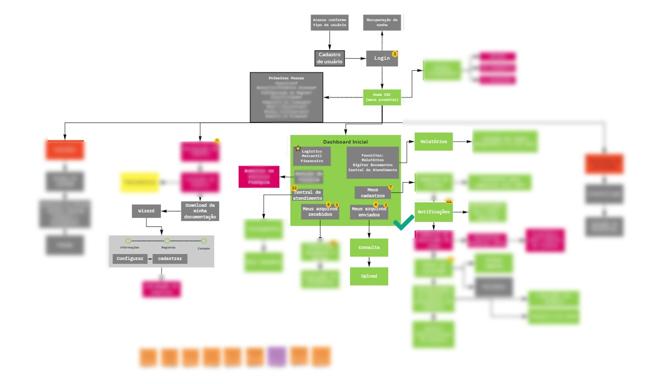
Flowchart of the main possible MVP user interactions
Validation cycles
Since the company has a small pool of large B2B clients—each with only a few users—we decided to select some of them for validation interviews using the wireframes of the new interface. I suggested presenting very rough wireframes to signal to the participants that there was still room for suggestions and constructive feedback. Highly polished wireframes can sometimes give the impression of a finalized interface, which may discourage valuable input during the design process.
Some wireframes presented to receive feedback from users
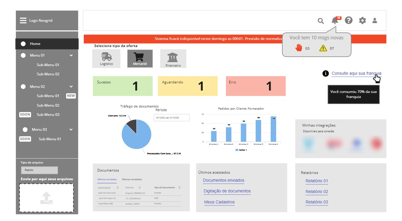
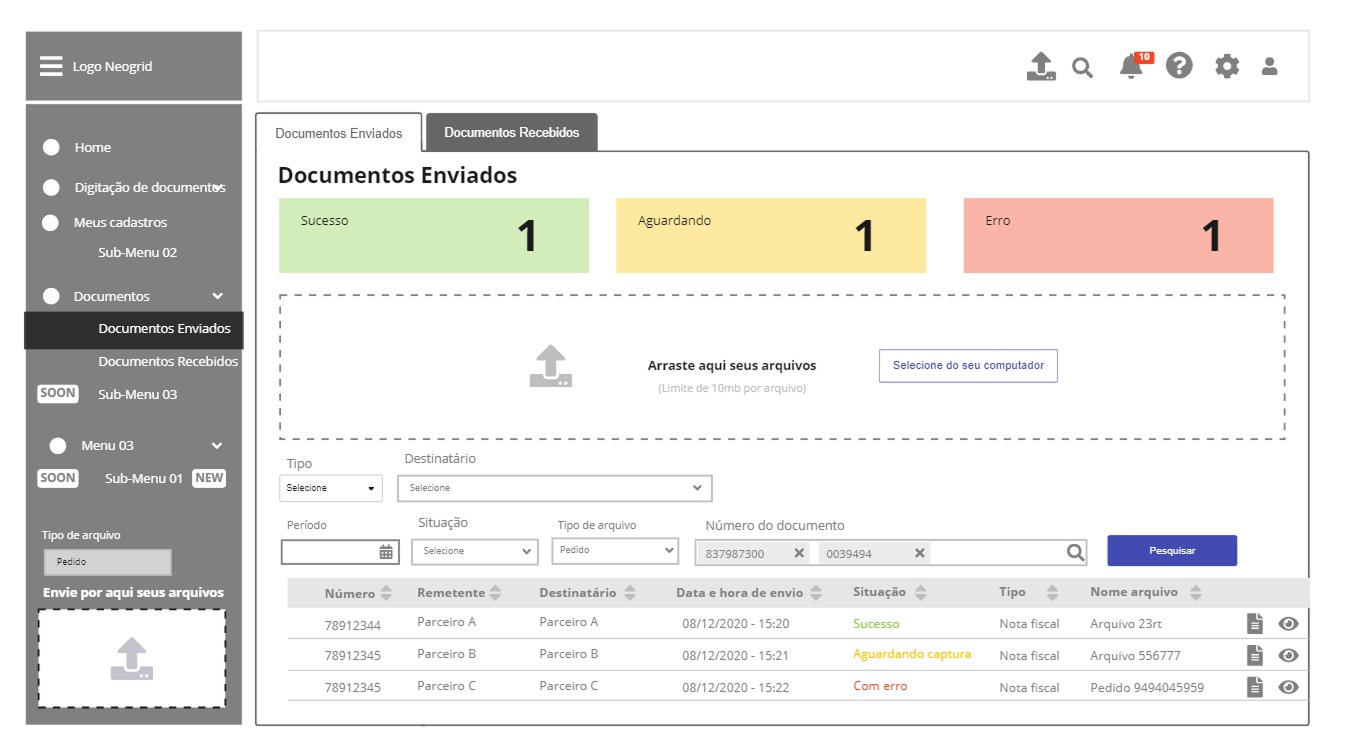
User interface
After the initial validation sessions, it was time to start the UI design. This task was greatly facilitated by another project happening at the time: the Neo UI Design System. It significantly reduced the burden of many design decisions and streamlined the software deployment for the development team, thanks to components that were aligned with the company's vision—both in design and technology—for their new products.
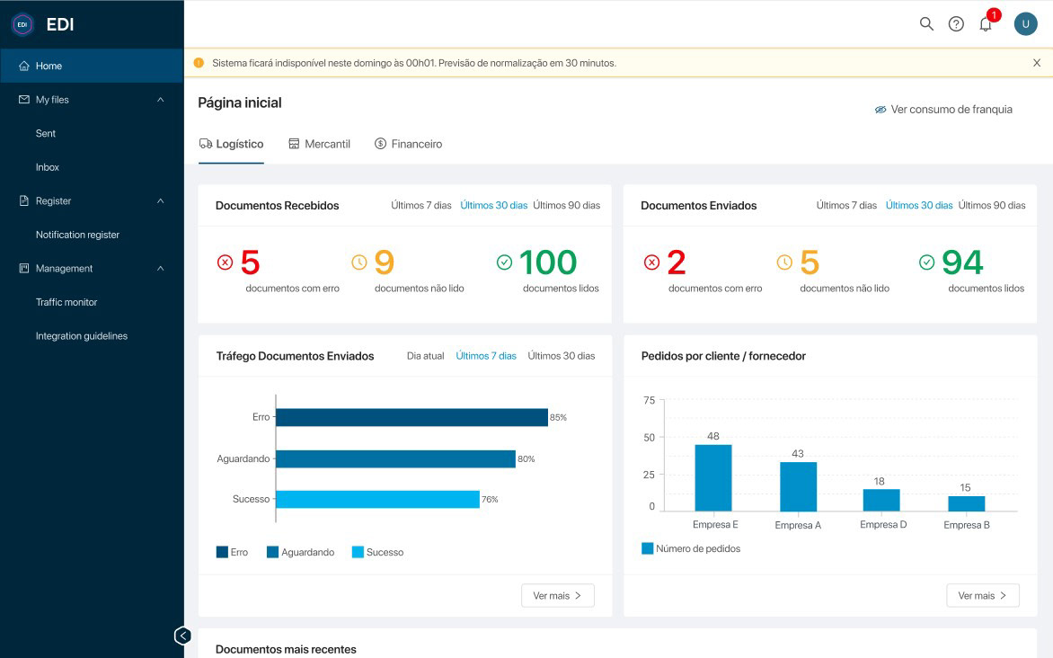
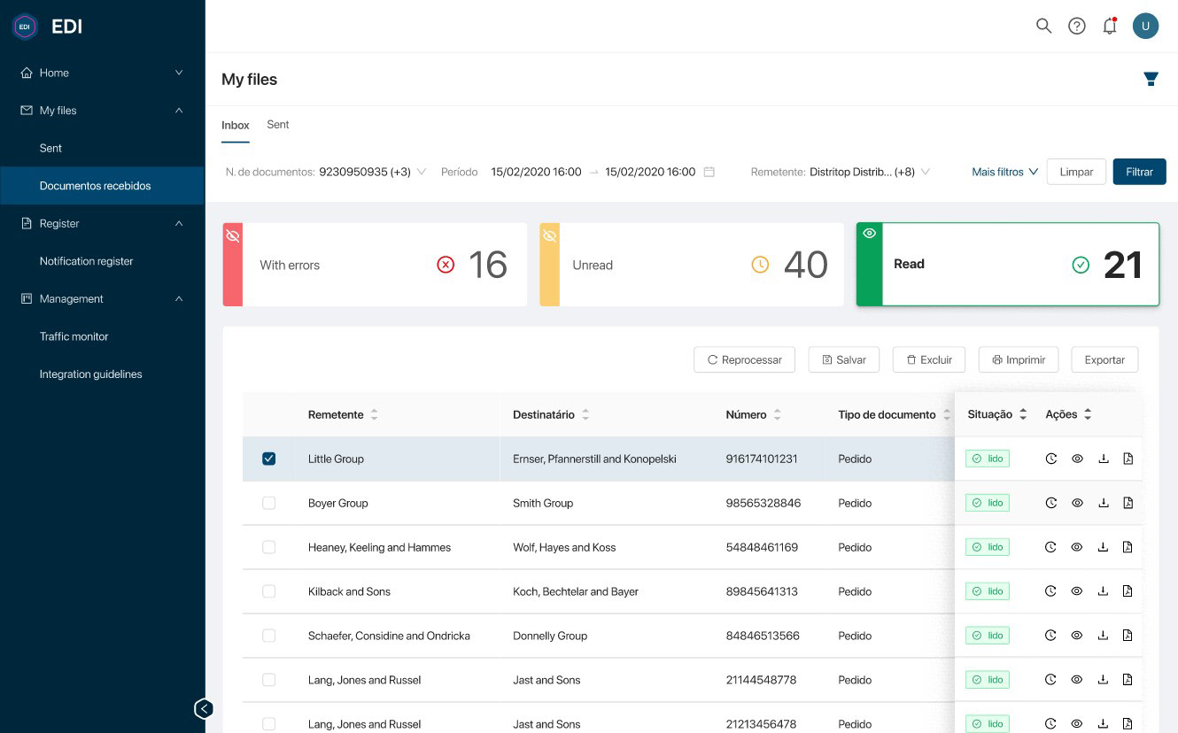
EDI high resolution mockups from Figma
Results
The initial results from the first few months of the MVP rollout to beta tester clients were promising:
✓ 62% reduction in customer churn: Strategic implementation in core user flows addressed historical usability gaps, directly improving satisfaction and reducing churn among previously at-risk accounts.
✓ 26% decrease in support requests: With clearer error visualization, the new interface has directly reduced support ticket volume by 26% as users can now troubleshoot issues autonomously.
✓ 42% shorter onboarding time for new user (by new partners operators) thanks to the more forgiven and user friendly interface.

